So! A few years ago I realised that not only did I pretty much only draw white people, but that I wasn't sure how to draw anything else. There is a long history of dark skinned people being made to look pale and POC being made to look white in order for them to be more palatable to pale white audiences. So there are ethical as well as artistic reasons to try not to screw this stuff up. I made a post poking at the problem, what have I learned since then?
Mainly I've learned that it's really not that hard to make dark skinned people look dark and POC to look like their ethnicity. It is a bit harder to do so in an aesthetically pleasing way when all you've practiced on before were pale white people, but the only way to fix that is more practice.
EDIT: A white person telling others how to draw POC is pretty hinky. Where possible I've tried to point towards POC talking about these issues, but thus far everything I've seen has focussed on drawing people realistically, so I feel my (unreliable) advice on drawing people stylistically is better than nothing. Still :/
Sometimes art doesn't include a lot of the things we use to recognise ethnicity in real life, and I think it's usually better to lean towards ambiguous ethnicity than to fall into racist stereotypes. You can't always tell ethnicity in real life, nor should you be able to in art. But all things being equal I think it's important to have a lot of art that is obviously of POC, to counter the white-as-default mindset so many artists and consumers of art fall into, especially with genre art and fanart. And you definitely want to avoid having POC characters look like they are unambiguously white.
There's also cultural factors like clothes, hairstyle, worldbuilding etc I'm not addressing in this post, not to mention all the other issue of representation like disability and gender. My examples are a mixture of fanart and original art since I think the same issues apply to both, and include some of my own work.
I AM NOT AN EXPERT. Take this all with a grain of salt and if I've screwed up anywhere please let me know. Also: not all dark characters are POC and not all POC are dark, I've tried not to conflate the two but there is obviously a lot of crossover. Race isn't the same thing as ethnicity, either.
Whatever style you draw in you first need to be able to picture the reality you are drawing. Afaict there are two main issues:
1) learning to depict a variety of facial structures/hair styles/colour undertones.
This doesn't just apply to ethnicity, nor does it only apply to POC (not all "white" ethnicities look the same either), but drawing POC to look like the wrong race has particularly unfortunate implications so is worth avoiding even if you don't care much about realism in general.
Some things to avoid:
-racist/antisemetic etc caricatures
-lumping visually distinct ethnicities together due to race: A Sri Lankan and a Korean may both be "Asian" but they probably won't look very similar.
-drawing people as your mental image of their race/ethnicity rather than what they actually look like
It's important to practice drawing individual people not just "types". If I'm doing an original character I often find a face model of the right approximate ethnicity/age/gender/etc instead of trying to remember and extrapolate from the subtle distinctions between ethnic groups.
2) lighting: pale skin tends to get subtle flat highlights and defined shadows, leading to the "dark eyes/edge of nose/background with white face" look. But shadows don't contrast as much with dark skin very much, and you get starker highlights on the nose/lips/forehead etc. This can look cool if you use bright coloured lights.
This means that the lighting that suits one skin colour may not suit another, and art techniques designed to flatter pale skin may not work so well for depicting dark skin. Looking at photos that include people of a variety of skin tones can be helpful in figuring out how they differ.
Tutorials:
Examples:
My tastes tend more towards stylised illustration, if you want more help drawing super realistic art I'm not much good, sorry! Same with advice on using traditional media other than graphite.
Anyway. How to draw stylised art without making everyone look like a generic pale white person?
If you have a SUPER stylised style you may not need to worry about it. See for example how XKCD draws black people: as exactly the same sort of stick figures used to draw everyone else. White doesn't have to be the default, and marking POC (or women etc) as Different when you don't have to implies all the unmarked characters are white/male etc.
Figuring out how much to change less generic but still stylised features can be tricky. I've seen Sluggy Freelance criticised for giving Freema Agyeman a pointy nose, for example, but you don't want to go too far the other way and give black characters MASSIVE round noses and lips/Asian characters "squinty" eyes etc. With my more stylised art (black dots for eyes, simple noses, generic face shape) I tend to vary my nose shapes and hairstyles and leave it at that.
I think the trick is to have a good sense of what exactly each stylised element is representing, which is useful for improving your art in general. If you draw a lot of anime-influenced same-face I recommend sketching the sort of conventionally attractive 20 something Japanese people anime/manga styles are riffing on and seeing what the stylisation is trying to convey. Also, keep an eye out for art of POC by POC artists.
With anime/manga the default is ethnically Japanese. Should white people be drawn differently to signify our relative "otherness"? Opinions vary, and I think it depends a lot on context. An artist drawing an entirely Japanese cast for an assumed Japanese audience is not in the same boat as someone drawing a single Japanese character amongst a mostly white cast for an assumed US audience etc.
Examples:
I think the most obvious thing to avoid here is drawing dark skin as paler than something's it's unambiguously darker than (like canonical clothing). And specifically, don't draw dark women as paler than their relatively pasty boyfriends just because it suits your assumptions about gender :P
But, for example, how do you convey dark brown skin when your art is in black and white?
Well...you don't necessarily have to! If you're just drawing the outlines of people then you can probably leave the skin white as usual, if you've drawn it right then ethnicity/actual colours etc should be clear or at least not actively contradicted.
Examples:
Ok, what about pencil sketches, or other monochrome-ish styles that do include shadows? First off: consider not having a white background. If nothing else, it often looks prettier. Consider merging or blending the shadows and midtones on dark skin leaving only the highlights white. Consider coloured shadows if the usual grey etc makes darker skin look fugly.
Examples:
What about soft, washed out colours? If you wash out everything then darker colours will still look dark by comparison. If you wash out everything except the super dark colours (black hair for example) it can get dicey, I find it's best to just look at your picture and if necessary fiddle with your colours. But if you JUST wash out the skin and not, say, the lips or paler clothes, then you are doing something wrong.
Examples:
Weird coloured lights can make things hard as well but the same basic principles apply.
Examples:
Cell shading is a very common technique: Black lines against vaguely realistic flat colours. It can be hard to make noses/closed or simplified eyes etc stand out against dark skin, but in my experience as long as you go back over your work and make the relevant lines neater and more defined they should be clear unless the character is SUPER dark. You can also usually get away without adding any highlights, but a few along the edge of the nose and lips can add depth and definition.
Examples:
Also: consider not using dark lines at all! (this is also an example of dark "skin" /= POC ;)) Another common approach I can't find any examples of is to make most of your lines black (or some other dark colour) with a few white/light lines any place the dark lines don't stand out.
Also note that not all browns are the same. I've noticed some fanart where the artist has obviously drawn the characters they think of as "black" a uniform dark brown with everyone else a uniform pale peach, even though the actual characters are a wide variety of shades and the "black" character's skin tone is more olive or coppery. Also do not draw Asian characters as yellow /o\ If you have trouble with colours (and I do myself!) maybe get someone to check it for you or practice on animated characters you can use the colour dropper tool on.
If you are working with a very limited palette and it's creating some unfortunate implications with your skin tones, consider changing your palette! For example, when I started this Avatar fanart drawn in a Homestuck style I was just using "web safe" colours like Homestuck does...but then everyone had to be WHITE or YELLOW or BROWN and it looked terrible so I used the actual skin tones from the show. Sometimes you have to sacrifice a little of your artistic vision not to be a jerk.
Very unrealistic colour combinations are a really complex situation. If you're drawing everyone in greens and blues, how do you indicate brown? I'm still dipping my toes into this style of art, and I think it has to be considered on a case by case basis. But that's true with any art drawn in this style, capturing reality in unrealistic colours is always a challenge.
Examples:
So! That's all the different stuff I could think of. I have no guarantee that actual POC and/or dark skinned people are actually ok with these depictions so don't take my word for it, but hopefully I've at least got you thinking. I apologise in advance to anyone going "Oh god that's painful, and she's encouraging more people to draw that way?", if you find any of these pictures or ideas wrongheaded please let me know.
Mainly I've learned that it's really not that hard to make dark skinned people look dark and POC to look like their ethnicity. It is a bit harder to do so in an aesthetically pleasing way when all you've practiced on before were pale white people, but the only way to fix that is more practice.
EDIT: A white person telling others how to draw POC is pretty hinky. Where possible I've tried to point towards POC talking about these issues, but thus far everything I've seen has focussed on drawing people realistically, so I feel my (unreliable) advice on drawing people stylistically is better than nothing. Still :/
Sometimes art doesn't include a lot of the things we use to recognise ethnicity in real life, and I think it's usually better to lean towards ambiguous ethnicity than to fall into racist stereotypes. You can't always tell ethnicity in real life, nor should you be able to in art. But all things being equal I think it's important to have a lot of art that is obviously of POC, to counter the white-as-default mindset so many artists and consumers of art fall into, especially with genre art and fanart. And you definitely want to avoid having POC characters look like they are unambiguously white.
There's also cultural factors like clothes, hairstyle, worldbuilding etc I'm not addressing in this post, not to mention all the other issue of representation like disability and gender. My examples are a mixture of fanart and original art since I think the same issues apply to both, and include some of my own work.
I AM NOT AN EXPERT. Take this all with a grain of salt and if I've screwed up anywhere please let me know. Also: not all dark characters are POC and not all POC are dark, I've tried not to conflate the two but there is obviously a lot of crossover. Race isn't the same thing as ethnicity, either.
Reality
Whatever style you draw in you first need to be able to picture the reality you are drawing. Afaict there are two main issues:
1) learning to depict a variety of facial structures/hair styles/colour undertones.
This doesn't just apply to ethnicity, nor does it only apply to POC (not all "white" ethnicities look the same either), but drawing POC to look like the wrong race has particularly unfortunate implications so is worth avoiding even if you don't care much about realism in general.
Some things to avoid:
-racist/antisemetic etc caricatures
-lumping visually distinct ethnicities together due to race: A Sri Lankan and a Korean may both be "Asian" but they probably won't look very similar.
-drawing people as your mental image of their race/ethnicity rather than what they actually look like
It's important to practice drawing individual people not just "types". If I'm doing an original character I often find a face model of the right approximate ethnicity/age/gender/etc instead of trying to remember and extrapolate from the subtle distinctions between ethnic groups.
2) lighting: pale skin tends to get subtle flat highlights and defined shadows, leading to the "dark eyes/edge of nose/background with white face" look. But shadows don't contrast as much with dark skin very much, and you get starker highlights on the nose/lips/forehead etc. This can look cool if you use bright coloured lights.
This means that the lighting that suits one skin colour may not suit another, and art techniques designed to flatter pale skin may not work so well for depicting dark skin. Looking at photos that include people of a variety of skin tones can be helpful in figuring out how they differ.
Tutorials:
- Chart for drawing different shades of skin
- Guide to human types
- on painting skin tones, and why lighting = pale is a fallacy
- Photos of dark skin under different lighting
- Thoughts on skin tones
Examples:
- World of Averages composite images of the "average" person from various places
- I attempt to make a dark character's features distinct in low lighting
- A striking photo that only works because of Grace Jones' dark skin
Stylised features
My tastes tend more towards stylised illustration, if you want more help drawing super realistic art I'm not much good, sorry! Same with advice on using traditional media other than graphite.
Anyway. How to draw stylised art without making everyone look like a generic pale white person?
If you have a SUPER stylised style you may not need to worry about it. See for example how XKCD draws black people: as exactly the same sort of stick figures used to draw everyone else. White doesn't have to be the default, and marking POC (or women etc) as Different when you don't have to implies all the unmarked characters are white/male etc.
Figuring out how much to change less generic but still stylised features can be tricky. I've seen Sluggy Freelance criticised for giving Freema Agyeman a pointy nose, for example, but you don't want to go too far the other way and give black characters MASSIVE round noses and lips/Asian characters "squinty" eyes etc. With my more stylised art (black dots for eyes, simple noses, generic face shape) I tend to vary my nose shapes and hairstyles and leave it at that.
I think the trick is to have a good sense of what exactly each stylised element is representing, which is useful for improving your art in general. If you draw a lot of anime-influenced same-face I recommend sketching the sort of conventionally attractive 20 something Japanese people anime/manga styles are riffing on and seeing what the stylisation is trying to convey. Also, keep an eye out for art of POC by POC artists.
With anime/manga the default is ethnically Japanese. Should white people be drawn differently to signify our relative "otherness"? Opinions vary, and I think it depends a lot on context. An artist drawing an entirely Japanese cast for an assumed Japanese audience is not in the same boat as someone drawing a single Japanese character amongst a mostly white cast for an assumed US audience etc.
Examples:
- Monster High Everyone has teeny noses and massive eyes. But there are subtle variations in the nose and eye shapes to indicate different ethnicities even when characters are green etc.
- Knives from Scott Pilgrim A Chinese character amongst white people all drawn in a very stylised way
- Black hair, comics, and you
Limited or altered palettes
I think the most obvious thing to avoid here is drawing dark skin as paler than something's it's unambiguously darker than (like canonical clothing). And specifically, don't draw dark women as paler than their relatively pasty boyfriends just because it suits your assumptions about gender :P
But, for example, how do you convey dark brown skin when your art is in black and white?
Well...you don't necessarily have to! If you're just drawing the outlines of people then you can probably leave the skin white as usual, if you've drawn it right then ethnicity/actual colours etc should be clear or at least not actively contradicted.
Examples:
- White and black characters in black and white
- Very stylised yet clearly African American characters
- Black and white but not just outlines Not sure her ethnicity is clear in this :/
Ok, what about pencil sketches, or other monochrome-ish styles that do include shadows? First off: consider not having a white background. If nothing else, it often looks prettier. Consider merging or blending the shadows and midtones on dark skin leaving only the highlights white. Consider coloured shadows if the usual grey etc makes darker skin look fugly.
Examples:
- Pencil sketch against coloured background (which I did because she looked too pale in the original sketch)
- Black and white with varying shading
- Black and white picture against coloured background with white highlights
- Sepia shading
What about soft, washed out colours? If you wash out everything then darker colours will still look dark by comparison. If you wash out everything except the super dark colours (black hair for example) it can get dicey, I find it's best to just look at your picture and if necessary fiddle with your colours. But if you JUST wash out the skin and not, say, the lips or paler clothes, then you are doing something wrong.
Examples:
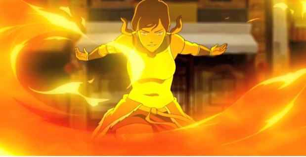
- Korra Firebending
- Watercolours I'm not 100% convinced Sokka is dark enough here, but certainly his skin is no paler than his pants and not much paler than his hair.
- Washed out lighting I think the relative shading of Charlotte's skin against her hair and Lizzy's skin makes it fairly clear what she'd look like in less extreme lighting.
- This mermaid was dark in my head but came out looking pale Not much I could do without totally recolouring the picture and since it's original noone but me was sad. Still, TOO MUCH OVERLAY.
- I think this original character reads as a POC (well, Sort-Of-Person Of Colour) despite the lighting making her face pretty pale
Weird coloured lights can make things hard as well but the same basic principles apply.
Examples:
- Black and white characters under different coloured lighting
- I attempt to draw Teal'c and a lightsaber
Cell shading is a very common technique: Black lines against vaguely realistic flat colours. It can be hard to make noses/closed or simplified eyes etc stand out against dark skin, but in my experience as long as you go back over your work and make the relevant lines neater and more defined they should be clear unless the character is SUPER dark. You can also usually get away without adding any highlights, but a few along the edge of the nose and lips can add depth and definition.
Examples:
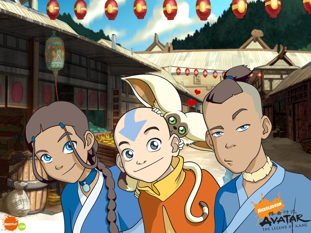
- Avatar the Last Airbender had no highlights
- Sketchy style with closed eyes
- Black dots for eyes
- Black dots for eyes, defined noses, minor highlights
- Thin lines and some very dark characters I actually think some of the details get lost here, but the pictures still look pretty nice.
- Most of Aimo's Dragon Age art includes POC drawn in a variety of styles.
Also: consider not using dark lines at all! (this is also an example of dark "skin" /= POC ;)) Another common approach I can't find any examples of is to make most of your lines black (or some other dark colour) with a few white/light lines any place the dark lines don't stand out.
Also note that not all browns are the same. I've noticed some fanart where the artist has obviously drawn the characters they think of as "black" a uniform dark brown with everyone else a uniform pale peach, even though the actual characters are a wide variety of shades and the "black" character's skin tone is more olive or coppery. Also do not draw Asian characters as yellow /o\ If you have trouble with colours (and I do myself!) maybe get someone to check it for you or practice on animated characters you can use the colour dropper tool on.
If you are working with a very limited palette and it's creating some unfortunate implications with your skin tones, consider changing your palette! For example, when I started this Avatar fanart drawn in a Homestuck style I was just using "web safe" colours like Homestuck does...but then everyone had to be WHITE or YELLOW or BROWN and it looked terrible so I used the actual skin tones from the show. Sometimes you have to sacrifice a little of your artistic vision not to be a jerk.
Very unrealistic colour combinations are a really complex situation. If you're drawing everyone in greens and blues, how do you indicate brown? I'm still dipping my toes into this style of art, and I think it has to be considered on a case by case basis. But that's true with any art drawn in this style, capturing reality in unrealistic colours is always a challenge.
Examples:
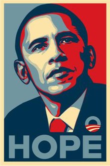
- Barack Obama again :)
- Here's some pictures I drew of POC characters using palettes I didn't get to pick:Utena: Astronomy, Avatar: Katara colour meme and Avatar: Azula colour meme, I tried to stick to giving darkish characters darkish skin but had to experiment a bit for all of them to get things to look right.
So! That's all the different stuff I could think of. I have no guarantee that actual POC and/or dark skinned people are actually ok with these depictions so don't take my word for it, but hopefully I've at least got you thinking. I apologise in advance to anyone going "Oh god that's painful, and she's encouraging more people to draw that way?", if you find any of these pictures or ideas wrongheaded please let me know.
no subject
no subject
no subject
no subject
Yeah :/
no subject
no subject
Anyway: This is both absolutely true and not a point I am near yet with my art. "Avoid drawing East Asians with pointy noses" is obviously a MASSIVE generalisation of the diverse facial structures of East Asian people...but it's a good place to start and not something everyone has figured out.
But you're right that it's very important to remember that these distinctions exist. Since I don't yet have much of a sense for the subtle distinctions between ethnicities (I'm still getting the hang of the typical physical distinctions between genders) I usually just find a face model of the approximately right ethnicity/gender/age etc and work from that.
no subject
no subject
thank you so much lmao
Re: thank you so much lmao